

That first glance a cosmetic brand wins or loses in two seconds on the shelf is often determined by the packaging. Cosmetic packaging production is precisely the business of managing that first glance: making a product stand out from a crowded shelf with the right form, the right color tone, and the right surface touch. Kosapack, as a premium and bespoke packaging partner based in Istanbul Zeytinburnu, constructs this shelf impact for cosmetic brands by uniting consultancy, structural design, sampling, and managed production stages under one roof.
This article explains how cosmetic packaging makes a difference both on the shelf and in the digital storefront environment—from a serum box to a store shopping bag, from an e-commerce shipping box to unboxing accessories; which processes Kosapack uses to produce this difference; and where your brand should start for its own product range.
Contents
- The job of cosmetic packaging on the shelf and in the digital storefront
- Packaging items in the Kosapack portfolio tailored for cosmetic brands
- Design decisions that create shelf impact
- Sustainable cosmetic packaging and material selection
- Kosapack's end-to-end production process
- Frequently Asked Questions
The job of cosmetic packaging on the shelf and in the digital storefront
Cosmetic packaging has to perform on two different stages at once. The first is the physical shelf: a pharmacy, perfumery, in-store display, or beauty salon counter. The second is the digital shelf: the small product photo on an e-commerce listing page. Although the requirements of these two environments overlap, they are not entirely the same.
On the physical shelf, packaging must offer a structure that is consistent with the brand identity, innovative, and functional; it is expected to support the product's safety, freshness, and user experience. Independent cosmetic consultancy sources emphasize that consistently conveying the logo, color palette, typography, and brand story on the packaging directly influences purchasing behavior. Shelf layout, color blocks, and product grouping are among the elements that determine whether a product is noticed in-store.
What actually separates these two environments is the decision distance. On the physical shelf, the customer can reach for the product, pick up the box, and feel its weight and texture; this is why material quality and the moment of opening come into play. On the digital shelf, however, the decision is made entirely through a visual representation: since the customer cannot touch the box, the perception of quality is formed only as much as the photo tells. For this reason, whether the same design does its job in both environments must be considered separately.
On the digital shelf, the rules of the game shrink. The product image must be legible and distinguishable from competitors even at thumbnail size. The brand name and the product's core benefit should be selectable at a glance; glossy surfaces should be chosen so as not to complicate photography. Therefore, a cosmetic package must be evaluated not only through the physical sample in hand, but together with its appearance both on the store shelf and in the digital storefront.
The practical questions that should be asked when deciding also arise from this dual perspective: In which channel will the product mostly be sold? What color and form are the competitors it stands next to on the shelf? Among the variants of the same series, how quickly can the customer find the right one? The answers to these questions determine which design decisions come first. For example, while legibility and photographability come to the fore for a serum sold predominantly in e-commerce, the tactile perception of luxury may take priority for a perfume in a perfumery.
Kosapack's approach to cosmetic packaging production is also based on this dual evaluation: a box is designed not because it looks nice while it's in our hands, but because it does its job in the real sales environment.
Packaging items in the Kosapack portfolio tailored for cosmetic brands
The shelf and unboxing needs of cosmetic brands are not met with a single box type. Kosapack's portfolio brings together, under one roof, the items that cover a cosmetic product's journey from start to finish.
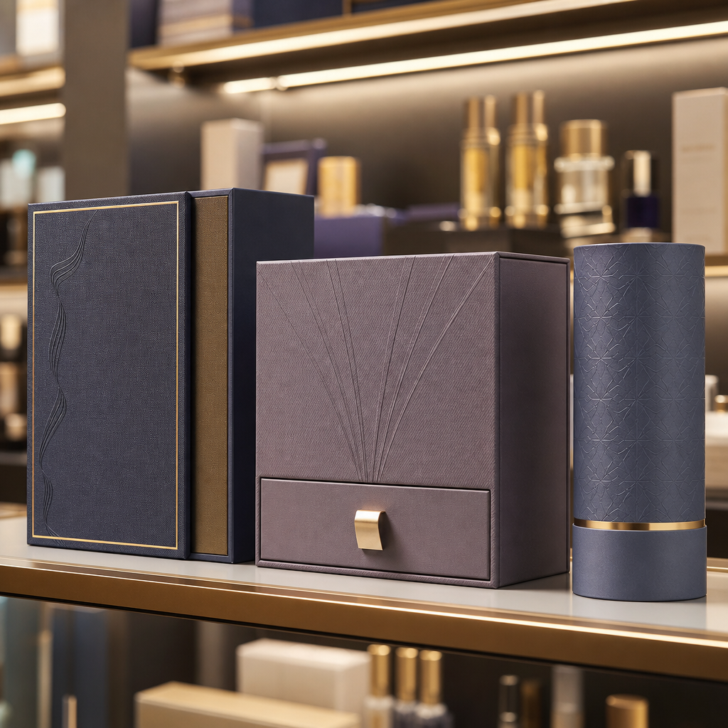
Rigid boxes are solutions that carry the perception of luxury to the highest level for perfume, skincare sets, and premium makeup palettes. High-lid structures, hidden magnetic closures, and drawer box forms strengthen both the shelf presence and the experience at the moment of opening. Thanks to their weight and firm surface, these boxes are preferred for products where a gift or high-segment perception is desired in the customer.
Folding carton boxes are a flexible and efficient option for fast-moving shelf items such as creams, serums, and hair care products. While these boxes adapt to mass production logic, they can preserve a premium feel with touches such as window cutting, embossing, or varnish. They offer a practical basis for balancing cost and shelf impact in high-volume, frequently renewed product groups.
Kraft and corrugated boxes make up the shipping and unboxing outer packaging of e-commerce and DTC cosmetic brands. In digital sales, the box becomes the brand's physical representative that travels all the way to the door; since the customer's first physical contact with the product begins with this box, the outer packaging is also designed as part of the unboxing experience.
Carton and paper bags are the corporate carrying solution for boutique cosmetic stores, dermocosmetic chains, and beauty salons. With choices of handle type, weight, and printing technique, the bag turns into a moving advertising board carried by the customer leaving the store. Our cardboard bag types guide, which examines the brand uses of different bag types, can help clarify the right bag setup for cosmetic retail.
Labels carry both the brand identity and mandatory information on bottles, tubes, jars, and compact packaging. Tissue paper, thank-you cards, dividers, fabric bags, and envelopes come into play as accessory packaging elements that complete the post-shelf unboxing experience and the gift/premium perception. These small touches can be decisive, especially in the first order experience, in building loyalty to the brand.
This breadth of portfolio allows a cosmetic brand to manage different product groups, different sales channels, and different price segments with a single partner; thus the brand language stays consistent without being scattered from item to item. The single-partner model also simplifies supply coordination: the color and print language of different items do not diverge from one another, and order tracking runs through a single point.
Design decisions that create shelf impact
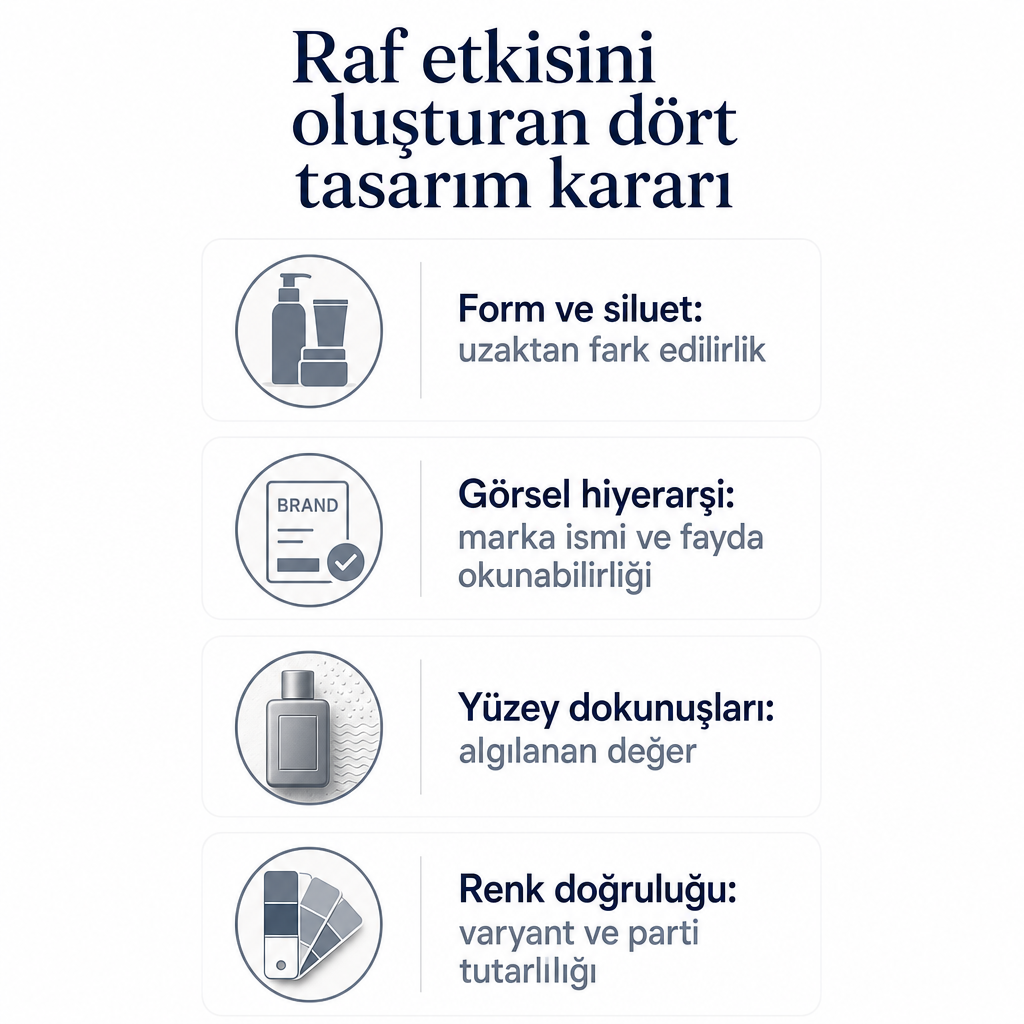
Shelf impact is born not from a single magical detail, but from design decisions that support one another. The decisions Kosapack highlights in cosmetic packaging design fall under the following headings.
Form and silhouette. The height and surface area of the box determine its visibility from a distance. A silhouette distinguishable from competitors becomes the element that first catches the eye on the shelf. Thanks to custom size and form production, the brand can develop a structure according to its own story instead of being squeezed into a standard box mold: options such as a high lid, a drawer structure, and a window-cut box are part of this flexibility. When deciding on form, the product's internal dimensions, transport safety, and the shelf's physical height limits are evaluated together.
Visual hierarchy. Correctly ordering the brand name and product benefit on the front face ensures legibility on both physical and digital shelves. Category-based color coding helps establish a consistent yet distinguishable appearance among the variants of a product family; while the customer perceives the series on the shelf as a whole, they also quickly find the right variant. This reduces the risk of picking the wrong product in multi-variant series while also preserving the integrity of the series on the shelf.
Surface touches. Post-print applications such as embossing, hot foil stamping, cellophane, and varnish raise the perceived value of the packaging. But balance is important here: since excessively glossy surfaces can create reflections in digital shelf photos, the finish choice is determined by testing it both in hand and on screen. While matte touches establish a calm premium perception for a product with natural and organic positioning, hot foil stamping can strengthen the luxury emphasis for a high-segment perfume.
Color accuracy. A tone difference, print error, or lamination flaw on the shelf can ruin a premium perception built over years in a single product. With the claim of applying high-color-accuracy proofing and pre-print control, Kosapack aims to preserve color consistency between variants and between batches. This consistency is the backbone of shelf integrity, especially in makeup and skincare series with many SKUs. Since a shift in tone can damage the perception of integrity on the shelf even when the same series is produced in different batches, pre-print verification is a critical stage.
All of these design decisions are not isolated aesthetic choices; each is a functional choice connected to the product's performance in the real sales environment. The right form provides visibility, the right hierarchy provides legibility, the right finish provides premium perception, and the right color management provides trust. Which of these a brand prioritizes varies according to its product range and dominant sales channel; therefore, the decisions are made not one by one, but balanced as a whole.
Sustainable cosmetic packaging and material selection
For modern cosmetic brands, sustainability is no longer a decorative edge of packaging, but at the center of purchasing criteria. Independent cosmetic consultancy sources note that recyclable, reusable, or compostable materials and a minimal design approach are gaining importance in cosmetic packaging.
Kosapack's material approach aligns with this trend: recyclable materials and a carbon footprint approach that reports environmental impact respond directly to the "eco-packaging" expectation. For brands with natural and organic positioning, kraft paper, with its matte appearance and texture, can tell this story from the very first touch of the packaging. To examine the properties and usage advantages of kraft paper more closely, our content on the uses of kraft paper and the properties and types of kraft paper offers a good starting point.
In material selection, sustainability and shelf impact can feed off one another. Cartons with recycled content and low ink use with minimal graphics both reduce environmental impact and establish a simple, reliable premium perception. Matte kraft printing can attract attention by creating a calm and natural contrast on crowded and glossy cosmetic shelves. This contrast also visually supports the brand's story in the consumer segment that makes environmental awareness a purchasing criterion.
Material decisions also have a technical dimension. It is stated that some cosmetic ingredients are sensitive to air and light, so dark or opaque structures and proper sealing and closing systems are important for product integrity. Kosapack's structural design stage can evaluate the internal dimensions and protection design according to the bottle or tube inside the carton box, closed structures for products that need protection from light, and solutions such as a secondary security label, seal band, or insert paper for sensitive products. Thus the sustainability goal can be constructed without overshadowing the requirement to protect the product.
Reusability is also a topic that builds a bridge between sustainability and perceived value. Box structures whose lids can be reclosed, internal organizing dividers, or designing the cosmetic box for a second storage scenario both reduce waste and extend the brand's visibility by making the customer keep the box rather than throw it away. Such multi-functional structures are evaluated among the elements that support user satisfaction and brand loyalty.
Supporting sustainability claims with concrete certificate names requires a separate verification process for the brand. The suitability of specific certificates to the project should be evaluated on a project basis after the product range and target market are clarified; therefore, it is a healthier path to start the sustainability conversation over the general material approach and determine the proof requirements together.
Kosapack's end-to-end production process
Turning cosmetic packaging production into a single managed process instead of breaking it into individual pieces is a critical advantage, especially for brands under launch-schedule pressure. Kosapack's service model aims for this integrity.
Clarifying brand identity and positioning. The process begins with the product packaging gaining a language according to the brand's premium/luxury, natural/organic, or young/dynamic positioning. A briefing meeting, moodboard work, and benchmark analysis lay the groundwork for the packaging language to come out consistent with the brand identity. Clarifying the positioning at this first stage determines the direction in which all subsequent design decisions will be optimized.
Analysis of product and protection needs. In the packaging and brand consultancy stage, the product's formula and sensitivity are taken into account. A light-sensitive serum and a store shopping bag require completely different structural decisions for the same brand. At this stage, internal dimensions, protection design, and, if necessary, secondary security solutions are determined.
Structural and graphic design. Box construction, transport, protection, and shelf presence are within the scope of structural design; graphic design and pre-print preparation, on the other hand, handle visual hierarchy and color management. When these two disciplines work together, form and graphics complement each other; the box's physical structure and the visual language on it are designed as a single whole.
Prototype and physical sample. Kosapack commits to physical sample production within 7–15 business days. This sample provides the opportunity to test the shelf impact in a real environment: touches such as size, color, gloss, embossing, and varnish can be tried in advance on a physical store shelf or in a photo and mock-up environment for the digital shelf. Thus, before production, a concrete reference is formed instead of risky estimates, and errors can be corrected before moving to high-volume production.
Managed production and quality control. Production carried out through verified manufacturing partners is supported by the claim of strict quality control. The aim is to minimize problems such as tone difference, print error, or lamination flaw that disrupt the premium perception on the shelf. Maintaining quality control throughout production is important for preserving consistency between variants, especially in multi-batch production.
Consolidated logistics and delivery. When different packaging items come from a single partner, delivery can also be managed from a single point. This reduces the coordination burden in a multi-item cosmetic launch and eliminates the need to track different suppliers separately.
Another practical element at the start of the process is a price quote within 24 hours. When it is necessary to meet the campaign schedule of a new cosmetic launch, a fast quote and fast sample resolve the biggest uncertainties in front of the decision at an early stage.
After clarifying your own product range (skincare, makeup, hair care, perfume) and your sales channel (retail shelf, pharmacy shelf, e-commerce), requesting a project-specific quote and design consultancy with this information stands out as the most logical next step.
Frequently Asked Questions
How is shelf impact achieved in cosmetic packaging production?
Shelf impact is born not from a single detail, but from the sum of decisions that support one another: a form and silhouette that is visible from a distance, the correct visual hierarchy on the front face, category-based color coding, and surface touches that raise the perceived value. The priority of these decisions varies according to the product range and dominant sales channel; while legibility comes to the fore for predominantly e-commerce products, the tactile perception of luxury may take precedence in a perfumery. Kosapack constructs these decisions by carrying out structural and graphic design together, so that they do their job on both physical and digital shelves.
Which types of cosmetic packaging does Kosapack produce?
The portfolio covers rigid boxes for perfume and skincare sets, folding carton boxes for products such as creams and serums, kraft and corrugated boxes for e-commerce shipping, carton bags for stores and salons, and labels for bottles and tubes. In addition, accessory packaging that completes the unboxing experience—such as tissue paper, thank-you cards, dividers, fabric bags, and envelopes—is also offered under one roof. This breadth makes it easier to manage different product groups and sales channels with a single partner and to keep the brand language consistent from item to item.
How long does the sample and quote process take?
Kosapack works with a price quote within 24 hours and physical sample production within 7–15 business days. This speed eases the decision process in terms of meeting the campaign schedules of new launches and verifying shelf plans through a physical sample before production. Thanks to the sample, touches such as size, color, gloss, embossing, and varnish can be tested in both the physical shelf and the photo/mock-up environment before moving to high-volume production.
What options are there for sustainable cosmetic packaging?
Recyclable materials, cartons with recycled content, and matte kraft printing for a natural/organic story are among the prominent options; low ink use with minimal graphics also supports both environmental impact and shelf simplicity. Reusable structures whose lids can be reclosed and that are suitable for a second storage scenario can reduce waste while extending the brand's visibility. Kosapack also states that it has a carbon footprint approach that reports environmental impact. The suitability of specific certificates to the project, however, is evaluated on a project basis after the product range is clarified.
How is mandatory information handled in cosmetic packaging?
Cosmetic packaging is expected to include elements such as ingredients, net quantity, usage instructions, and the PAO symbol indicating the period of use after opening. This information is included in the design and label work; however, since the full scope of mandatory texts can vary according to the market and legislation, it is recommended to verify it through the current official Turkish legislation and, when necessary, a legal advisor before going to print. This verification is particularly important for brands selling to different markets.
Should packaging design for e-commerce be different from the physical shelf?
Yes, some priorities change. On the digital shelf, the product image must be legible even at small thumbnail size; the brand name and benefit should be selectable at a glance, and glossy surfaces should not complicate photography. On the physical shelf, on the other hand, since the customer can pick up the box, material texture and the opening experience come to the fore. During the sample stage, Kosapack tests the design in both the physical shelf and the digital storefront environment, aiming for a consistent appearance in both channels.