
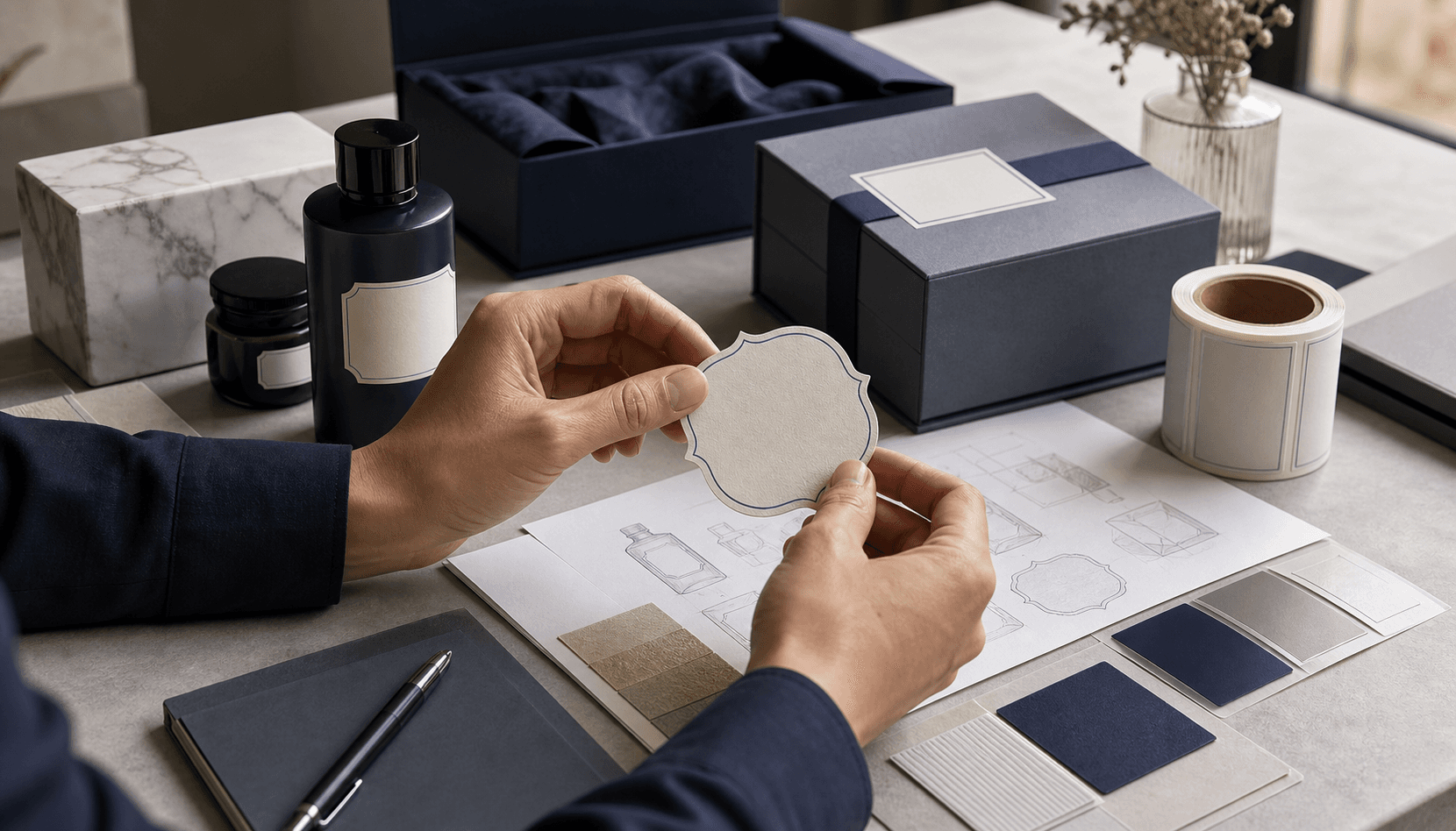
You have a finished product in hand. A serum bottle, a chocolate bar, or a candle jar — ready to ship. But when you look at the label, something inside you feels uneasy. It looks flat. Generic. So ordinary it could be mistaken for a supermarket's own-brand product. That feeling doesn't lie; when label design goes wrong, the product loses value on the shelf no matter how good it is. A perception study conducted by OnlineLabels with 587 U.S. consumers puts numbers to this instinct: products using premium label materials (metallic, kraft, clear gloss) were preferred in 80% of purchase scenarios over identical products with standard white matte labels, found 49–65% more appealing, and perceived as 27–44% higher quality — even though the product inside the box was exactly the same. Since the study was funded by a label supplier and conducted only with U.S.-based online participants, it's not absolute truth; but the direction is right.
Here's the problem: label design is often treated as a purely aesthetic matter ("make it look nice"). Yet it's a technical-commercial discipline encompassing material, printing technique, color management, legal compliance, and brand systems. The 10 golden rules below close the gap between "looks nice" and "wins on the shelf." This isn't an inspiration list; it's a set of concrete rules that guide decision-making throughout the label design process.
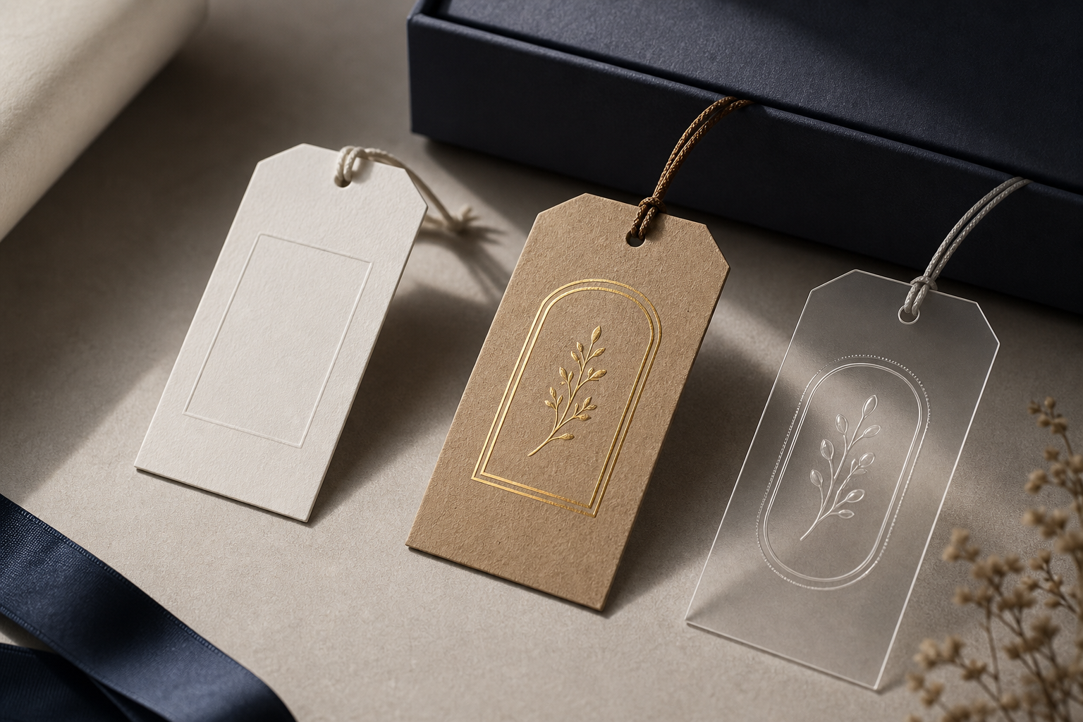
Table of Contents
- 4 Decisions You Need to Make Before Starting Label Design
- Choosing the Right Label Material and Printing Technique
- Typography and Hierarchy: Balancing Readability with Aesthetics
- Color Management and Pre-Print Proof Check
- 6 Design Details That Create Premium Perception
- Label Design by Industry: Cosmetics, Food, Spirits, and Jewelry
- 5 Critical Mistakes When Moving Label Design to Production
- Are You Print-Ready? A Practical Checklist
- Frequently Asked Questions
4 Decisions You Need to Make Before Starting Label Design
The decisions that determine every color, every font, every layout are made before design begins. The label design process starts not by opening a design program, but by clarifying four strategic decisions. If you skip them, every downstream choice is built on a wrong foundation.
Application surface. The surface the label will adhere to — glass, plastic (PP/PE/PET), cardboard, fabric — directly determines the adhesive type and material family. Curved bottles and jars require flexible film stock; flat cartons easily carry paper labels. The critical point emphasized in Sanle Plastics' cosmetic packaging guide: the primary packaging material must not chemically react with the formula inside. For active skincare products and serums, this prevents the risk of leakage and degradation. Choosing the right packaging materials starts with the surface.
Usage environment. Where will the product live? In the refrigerator, in the humid environment of a bathroom, outdoors, or on a frequently handled shelf? According to Labelprint24's material comparison, paper labels are ideal for dry, indoor, short-term, and low-stress uses. Film labels (PP, PE, PET) resist moisture, chemicals, and temperature fluctuations — mandatory for refrigerated food, cosmetics, and outdoor products. UPM's cosmetic label data confirms the necessity of film for labels exposed to bathroom humidity and oil. If you select material outside the usage range, the result is peeling, wrinkling, and ink degradation.
Brand positioning. Mass-market or premium? This decision determines your finishing process and material budget. Premium positioning justifies foil, textured stock, and spot UV; for a shelf product these are unnecessary costs. Choosing materials without clarifying your positioning leads either to overspending or to looking inadequate.
Legal requirements. Ingredient list, barcode, origin, warning texts. These are non-negotiable and reshape the layout hierarchy. We'll go into detail in the industry section, but know this already: legal text is not a detail added at the end of design, but a constraint you must allocate space for from the very beginning.
A label is not the product's packaging; it's the brand's first handshake with the consumer.
Choosing the Right Label Material and Printing Technique
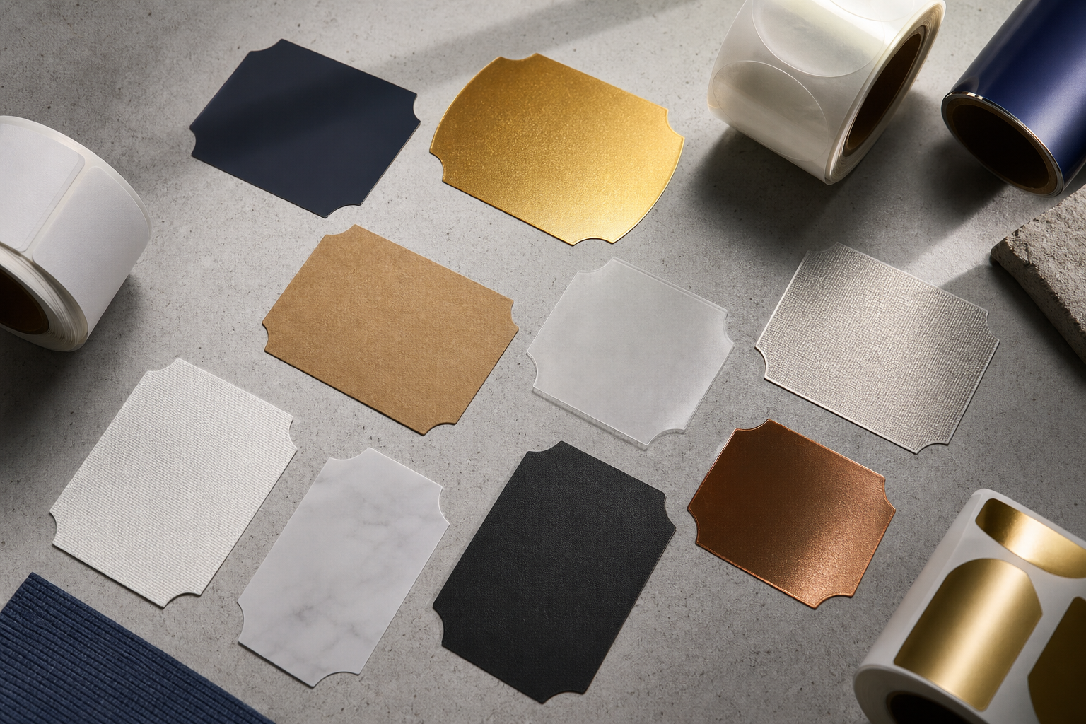
Once the four decisions are clarified, you can now select the actual substrate. Label material selection is an engineering decision that comes before the aesthetics of design. The table below compares material types by practical criteria.
| Material | Appearance / Feel | Moisture & Abrasion Resistance | Cost | Suitable Industry |
|---|---|---|---|---|
| Coated paper | Clean, matte/glossy | Low | Low | Dry food, in-box |
| Film (PP/PE/PET) | Smooth, vibrant | High | Medium | Cosmetics, cold products |
| Textured paper | Sophisticated, tactile | Medium | Medium-high | Wine, premium food |
| Metalized | Luxurious, shiny | Medium-high | High | Spirits, cosmetics |
| Clear (no-label) | Invisible, modern | High (film) | High | Cosmetics, beverages |
| Kraft | Natural, organic | Low-medium | Low-medium | Organic food, DTC |
In terms of sustainability: coated paper, textured paper, and kraft paper are recyclable; film and metalized materials offer limited recycling due to their plastic content. This is a direct material constraint for brands making sustainability claims.
Substrate selection alone communicates the difference between premium and basic. OnlineLabels' research shows that premium materials make products appear 49–65% more appealing and perceived as 27–44% higher quality. In other words, material sends a message before anyone even reads the label. Film substrates (PP/PE/PET) are markedly more durable than paper against moisture, chemicals, and temperature; while paper offers a cost advantage but demands durability considerations.
Three paths stand out in premium label material selection: clear-on-clear films create a modern, "label-free" look; metalized foils add luxurious shine; textured papers provide tactile sophistication. UPM's cosmetic label guide notes that all three of these approaches create premium visual impact on bottles and jars while maintaining durability.
Label printing techniques also come into play here: surface treatments such as foil, spot UV, and embossing multiply perceived value. However, we leave their detailed analysis to the premium section — here the matter is material logic, not the finishing catalog.
Typography and Hierarchy: Balancing Readability with Aesthetics
Not every text element on a label is equal. Professional label design is built on a three-layered visual hierarchy, and this hierarchy determines where the consumer's eye goes first.
The primary zone is the brand name and logo. It should be the largest, highest-contrast element — readable on the shelf from an arm's length. The consumer spends milliseconds recognizing the product; the primary layer wins or loses this first contact.
The secondary zone is the product description, variant, or main claim: "Uncured," "Vegan," "100% Arabica." It requires a placement of medium weight that clearly separates from the primary layer but stands out from the tertiary layer. This is the layer that answers the consumer's question, "is this what I'm looking for?"
The tertiary zone is mandatory legal information — ingredients, net quantity, batch number, warnings. The smallest layer, but with a non-negotiable condition: it must remain legible at final print size, on a curved surface. This is the point that cosmetic labeling training insists on; every mandatory element must be readable not on screen, but on the actual product, at actual size.
The typography principles that create a premium feel are built on restraint. Use at most two typefaces. Create weight contrast instead of variety — the light and bold variants of the same family look more sophisticated than two different font pairings. Be generous with kerning (letter spacing); cramped letters look cheap. Maintain alignment discipline. The most common pitfalls: too many typefaces, legal text too small to be readable at print size, and weak figure-ground contrast.
These principles are not aesthetic preference but perception science. Research conducted by the University of Twente on dairy product packaging showed that packaging visual cues (color, imagery, layout) systematically shape how consumers categorize a product and judge its quality — even without the product changing. Design congruency also matters. In the de Sousa 2020 study summarized by the Vinhood Observatory, congruent color-shape combinations on coffee packaging (green label + angular shape, pink label + round shape) received markedly higher liking than incongruent combinations — while the coffee in the box was the same.
The honest caveat here: the same Twente researchers found that product expectations and prior experience also play a major role. In other words, label design alone cannot rescue the quality of an inconsistent product. Good design doesn't sell a bad product; it carries a good product to the perception it deserves. The balance between label readability and aesthetics is established precisely here: a design that pleases the eye but obstructs information loses its function.

Color Management and Pre-Print Proof Check
The technical discipline that separates amateur results from professional ones is color management. A color that looks perfect on screen can convey an entirely different brand on the wrong material. The five steps below make the label color management process print-ready.
1. CMYK or Pantone? CMYK is preferred for photo-heavy visuals and cost-effective printing, but it allows variation between print batches and substrates. Pantone spot colors, on the other hand, are chosen when the exact brand color must be preserved across different materials and printers. The practical recommendation from packaging manufacturers like EcoEnclose and TheCustomBoxes is clear: Pantone for key brand elements, CMYK for complex visuals. Pantone's own technical data makes this difference concrete: the Extended Gamut system (CMYK + Orange, Green, Purple) provides roughly 90% better matching to Pantone Spot Colors compared to standard CMYK — critical for cases in premium packaging where small color shifts disrupt brand consistency.
2. Screen color ≠ print color. The colors you see as RGB on screen shift markedly when converted to CMYK or Pantone and printed on uncoated, absorbent substrates. As It's A Wrap demonstrated in its grease-proof food paper example, the same file can produce an entirely different color on a different material. Don't trust the screen.
3. Color profile (ICC) and file preparation. Proofs should be produced according to recognized standards like GRACoL or FOGRA and evaluated under standard lighting. This way, a contract proof predicts the final print in advance within defined tolerances. As color management instructors emphasize, a file without a profile is a gamble.
4. Why a physical proof is essential. Always request a proof printed on the actual material before mass production. A digital proof is a starting point; a physical proof is reality. Skipping this step can result in tens of thousands of labels in the wrong color.
5. Color shift check by material. Verify color and readability on the actual substrate, including the curved surface. A color that looks flawless on a flat sample may reflect light differently on the curve of a bottle. The CMYK vs Pantone difference becomes most meaningful here, in the actual material test.
A color that looks perfect on screen conveys an entirely different brand on the wrong material.
6 Design Details That Create Premium Perception
Material selection determined the substrate. Now we move on to the design and finishing decisions that multiply perceived value. Premium label design creates a luxury perception through these six details added on top of the right substrate.
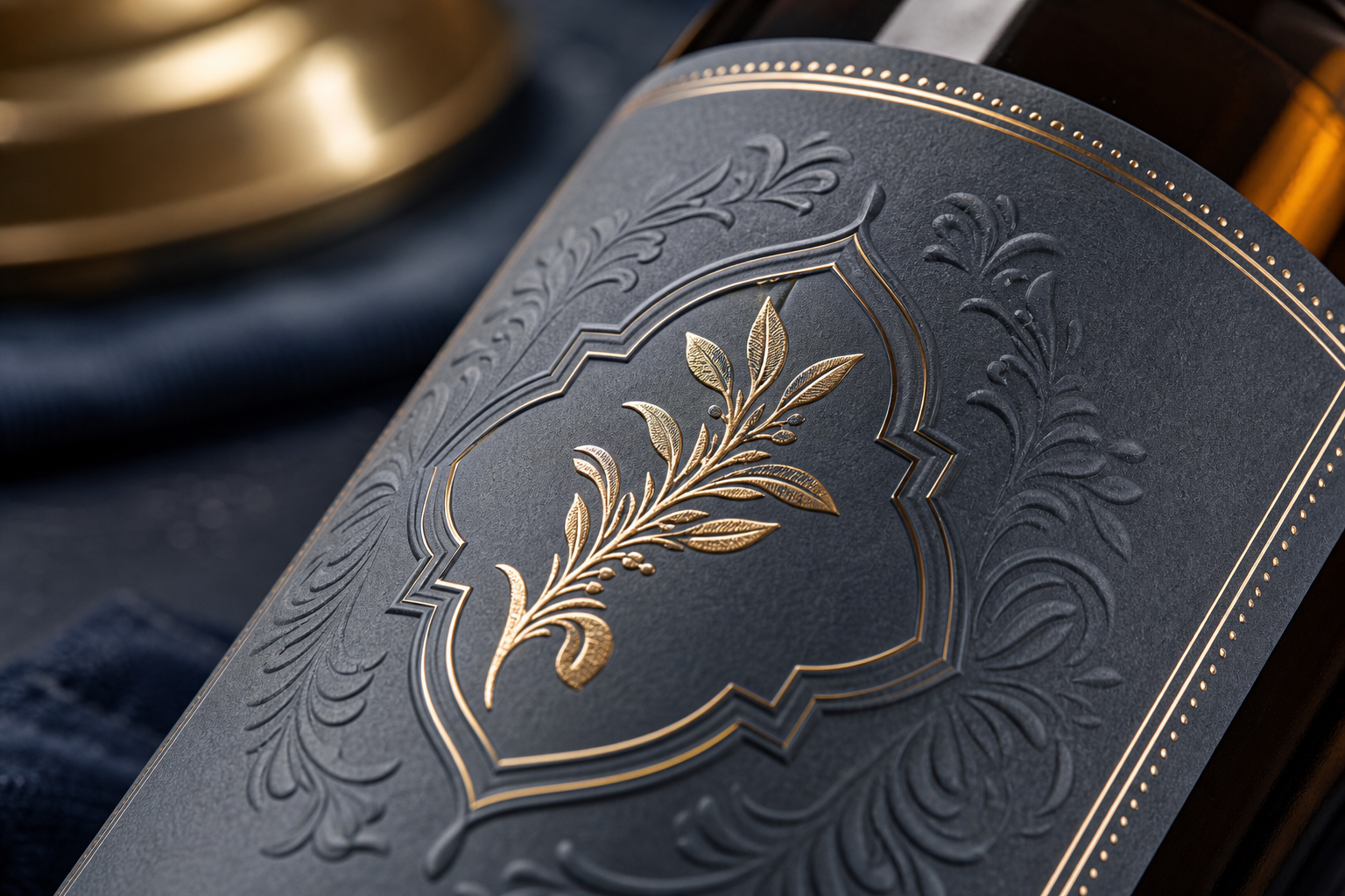
Surface treatments. Tactile finishes like foil, embossing/deboss, and spot UV increase perceived value and stand out on the shelf. Returning to OnlineLabels' data: premium substrate and finishes raise the "high quality" perception by 27–44%. These treatments engage the sense of touch — and touch is more persuasive than the eye.
Use of white space. Negative space is a sign of confidence and premium positioning. Filling a label with information looks cheap; a layout that breathes says the brand is self-assured. Think of the simple labels of luxury perfumes — emptiness is luxury.
Minimalism and restraint. Fewer elements, a stronger hierarchy. Reducing visual noise directs the consumer's eye to what matters. Every element must serve a purpose; if it doesn't, it should be removed.
Die-cut labels. Custom silhouettes stand apart from rectangular commodity labels. A cut that fits a bottle perfectly and reflects the brand form is far more memorable than a standard label.
Material texture and tactile feel. Textured stock invites touch and reinforces the quality signal. The consumer reads the label with their fingers; a smooth, quality texture confirms premium perception by hand.
Consistent brand color palette. A disciplined palette across SKUs builds recognition. The Pantone spot color consistency we discussed in the previous section comes into play here: preserving the same brand color across packaging types makes your product family recognizable as a whole.
There's one more nuance about value perception. The label message can carry perceived value beyond the product itself. In the Van Doorn 2021 study, beer carrying an ethical/sustainability claim was found more enjoyable and generated a higher willingness to pay than the same beer without the claim. In the Lotz 2013 research, fair-trade labeled coffee and chocolate received higher quality and taste perception despite being the exact same products. Both findings come from academic studies compiled by the Vinhood Observatory.
Honest counter-note: a 2025 systematic review examining 26 studies on visual sustainability labels showed that effects vary from study to study, and that poorly designed or ambiguous labels may not change behavior. This review, published on ScienceDirect, reaches a clear conclusion: finishes and claims work — but only when they are clear and convincing. Adding a sustainability icon to a label alone guarantees no effect.

Label Design by Industry: Cosmetics, Food, Spirits, and Jewelry
The general rules are constant, but each industry's constraints reshape them. The difference between cosmetic label design and a food label is not a matter of aesthetic preference, but of legal and physical necessity. The matrix below summarizes the sectoral differences.
| Industry | Priority Material | Critical Legal Info | Surface Treatment | Design Tone |
|---|---|---|---|---|
| Cosmetics | Film / clear | INCI, PAO, batch no. | Foil, spot UV | Minimal, clean |
| Food & Beverage | Paper / film | Ingredients, allergens, expiry | Matte coating | Information-dense |
| Spirits | Textured / metalized | Alcohol content, origin | Embossing, foil | Prestigious |
| Jewelry | Small label / card | Karat, origin | Foil, embossing | Ultra minimal |
| E-commerce / DTC | Kraft / film | Brand & content | Die-cut | Experience-focused |
The fundamental tension is between information density and minimalism. Food labels must carry information; cosmetic and jewelry labels draw power from simplicity. What governs this tension is regulation.
Food (EU): Regulation (EU) No 1169/2011 mandates the clear presentation of ingredients, allergens, nutritional information, net quantity, minimum durability date, and responsible operator information. These requirements directly determine hierarchy and minimum font sizes. Turkish brands exporting to the EU must comply with this regulation — spirits label design shares the same discipline due to alcohol content and origin requirements.
Cosmetics (EU): Regulation (EC) No 1223/2009 requires product function, nominal content, batch number, durability/PAO symbol, origin (where applicable), precautions, and a full ingredient list with INCI names. The European Commission's cosmetic legislation requires that both inner and outer packaging carry the necessary information legibly. As cosmetic labeling training emphasizes, keeping the INCI list legible at final size on a curved bottle requires its own design discipline.
Jewelry, on the other hand, is the world of micro-labels: a tiny surface, minimal information, mostly on a card or box instead of a label. In jewelry label design, luxury comes from simplicity and the flawless execution of a small number of elements. For e-commerce and DTC brands, unboxing takes priority; a sustainability message resonates with this audience.
5 Critical Mistakes When Moving Label Design to Production
The design file may be ready, but the handoff to production carries its own pitfalls. In the label print preparation process, the most expensive mistakes stem not from design but from handoff. Here are five preventable errors.
1. Skipping bleed and safe area. Without a 2–3 mm bleed and an inner safe margin, the cutting process either leaves white edges or crops the content. Even if your design looks flawless on screen, the cutting machine has tolerance. Bleed is the insurance for this tolerance.
2. Sending a low-resolution / RGB file. A print-ready file must be in CMYK or vector format and at least 300 dpi. RGB shifts in printing, while low resolution pixelates. This is the concrete result of the problem we discussed in the earlier color shift section: a visual that looks bright on screen turns into something else at the printer when sent in the wrong mode.
3. Barcode size and contrast error. The barcode must meet the minimum size and use dark-on-light contrast, otherwise scanners can't read it. Avoid placing the barcode on foil or reflective surfaces — the shine disrupts scanning. A barcode that can't be read means the product can't be sold at the register.
4. Skipping material–print incompatibility without prototyping. Verify the substrate, ink, and finishing process together on a physical proof. Remember Labelprint24's usage range warning: skipping this step means taking on the risk of peeling, cracking finishes, and color mismatch. Material alone and ink alone cannot be tested — they must be tested together.
5. Leaving legal texts to the last minute. Legal text, INCI, and allergen information guide layout. Trying to cram these in after the design disrupts the hierarchy. As cosmetic labeling training emphasizes, every mandatory element must remain legible at final print size — planning this from the start gives a much cleaner result than retrofitting it later.
Are You Print-Ready? A Practical Label Design Checklist
The list below can be copied and handed to a designer or supplier. Each item is a yes/no verification question and explains in a single line why it matters. Check every box before sending your label design file to production.
- Have the application surface and material (paper/film/kraft) been approved? — Is the durability suitable for the usage environment; are you not using paper in a humid environment?
- Has the color system (CMYK / Pantone spot) been determined and the ICC profile defined? — Will key brand colors remain consistent across batches?
- Has a physical proof / prototype been requested on the actual material? — Screen color doesn't guarantee print color; have you seen it on the actual substrate?
- Are the legal text, INCI/ingredients, barcode, and origin legible at final size? — Has it been tested on a curved surface and at actual print size?
- Do the bleed (2–3 mm), safe area, resolution (≥300 dpi), and vector format comply with standards? — Will the cut not leave white edges and the visual not pixelate?
- Have the sectoral requirements (EU 1169/2011, cosmetics 1223/2009, curved surface readability) been met? — Is the mandatory information for your export market complete?
- Do the surface treatments (foil/emboss/spot UV) not obstruct the barcode and readability? — Is there a barcode over foil or text unreadable under spot UV?
A good label design finishes on screen; a great label begins on the physical proof you hold in your hand.
The transition from screen to shelf is not a leap but a sequence: consultation → color-accurate proof → physical prototype on the actual material → production managed with verified quality control. What turns a good design file into a great physical label is the discipline of this label print preparation checklist. Every step has its own verification point, and each verification prevents the next step's error. When your label sits in your hand — on the right material, in the right color, and legibly — that's when the design is complete. Anything before that is just a guess.
Frequently Asked Questions About Label Design
Which program is used for label design?
Vector-based tools — Adobe Illustrator and CorelDRAW — are preferred over raster tools (Photoshop). The reason is technical: labels remain sharp only when scaled and printed from vector paths. Die-cut and surface treatment layers are also defined as vector spot channels. Photoshop is necessary for photo editing, but the final print file must be vector-based; otherwise, blurring at large sizes and cutting errors are inevitable.
What is the minimum number of labels I can print?
There are two production methods. Digital short-run printing offers a low minimum order quantity (MOQ) and is cost-effective for small batches and product tests. Flexo and offset mass production, on the other hand, require a higher MOQ but significantly reduce the unit cost at volume. The choice depends on two variables: quantity and finishing requirement. Treatments like foil and embossing raise the minimum quantity in some methods. If you're starting with a small brand, digital makes sense; when you move to established volume, flexo/offset does.
How many days does it take to go from label design to printing?
The general flow is constant: design → digital proof → physical proof approval → production. A physical proof adds a few days, but prevents expensive errors that can arise in mass production. To shorten the timeline, instead of skipping the physical proof, clarify the legal text and material decision from the very start — most delays stem from uncertainty in the design phase, not from the printing itself.
Is a clear (no-label look) label suitable for every product?
No. Clear-on-clear film requires a smooth, transparent, or uniform container surface. Dense legal text and low-contrast backgrounds reduce readability, so information-dense products — like some foods — may not be suitable for this look. As UPM's cosmetic label guide states, the no-label look shines in cosmetics and beverages, while causing readability problems in products carrying long ingredient lists. Your container's surface and information load directly determine this choice.